


")

With the influx of PC and mobile devices, we are living in a fully digital time. The devices and the internet have become an integral part of our life and a necessity to get through our day. Every client wants a mobile version of their website. But each of these devices has screens of different sizes, resulting in the growth of responsive web design.
Introduced by Ethan Marcotte in 2010, the term responsive web design has evolved over the years. With the increasing popularity for and mobile internet, businesses are working towards incorporating the best responsive elements into their website.
The general elements that constitute web design are navigation, arrangement, presentation and display of the content. This blog talks about the best practices of responsive web design and picked 8 of the most successful and inspiring web design examples.
What is Responsive Web Design?
Responsive Web Design denotes the concept of developing a website where the layout will change and adapt to the user’s screen resolution. This approach will ensure that the design and development respond to the user’s environment and input based on the screen platform, size, and orientation.
Responsive web design approach consists of a combination of flexible layouts, images grids, and intelligent use of CSS media queries. For instance when the user switches from his laptop to his iPhone, the website must automatically adapt to the screen size, image size and resolution.
Through responsive web design, the website will have a technology to consistently respond to user preferences. This approach eliminates the time and resources spent for changing the design for each gadget.
How to Test Responsiveness of your Website
There are several tools to test your website’s responsiveness. We recommend you to use LT Browser.
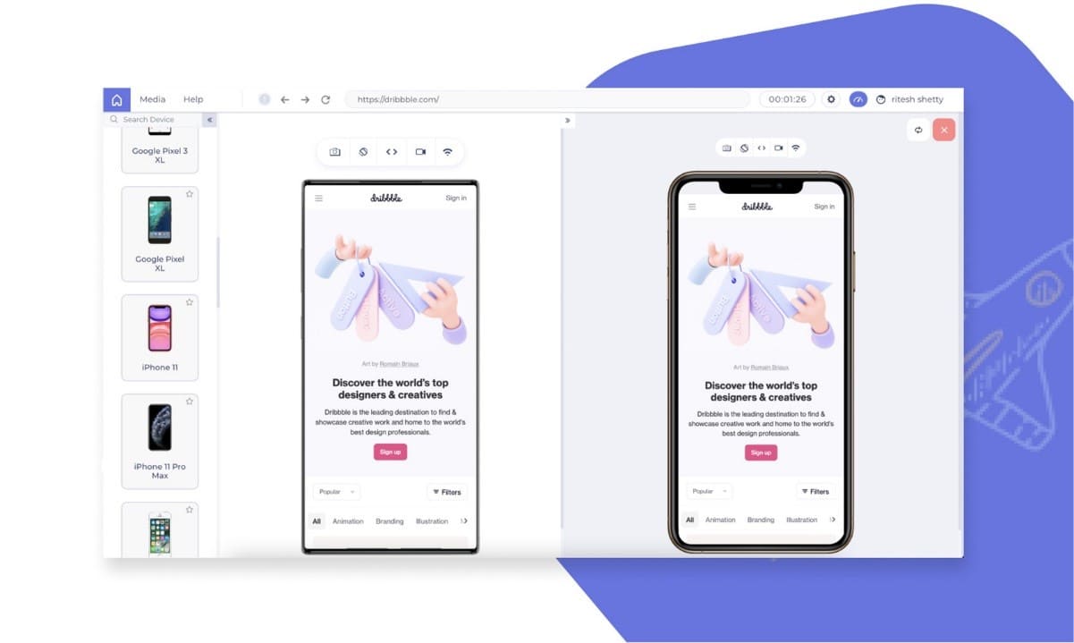
LT Browser is the ideal tool that ensures that your website looks seamless across different screens and devices resolutions. LT browser supports testing and debugging on over 45+ devices resolutions at once. You can also record the video of the test sessions for future reference. One of the best web design tools in the market, you can check the responsiveness of all your web pages through the LT browser.
Download LT Browser – https://www.lambdatest.com/lt-browser
Responsive Web Design Best Practices
While designing responsive websites, the designers must keep in mind some important aspects. Here are a few best practices for responsive web design:
Use of Fluid Design
There is a distinct difference between fluid design and responsive design that designers must recognize. While responsive design uses fixed pixel units to define breakpoints to scale the UI, fluid design can be used to automatically resize content depending on the screen you are viewing it on.
The designers must be careful with fluid designs as they can look strange depending upon the size of the device or browser. The content may appear cluttered in small screens or stretched on bigger screens. For the best website user experience on multiple screens, it is recommended to use responsive design instead of fluid design.
- Use Breakpoints
Breakpoints feature of CSS determine how the content of a website appears on various screen resolutions. These are determined by minimum and maximum width values of pixels in a screen. Breakpoints are generally designed differently for tablets, mobile devices, and desktops. More the breakpoints, better the flexibility and coverage across devices.
- Prioritize Content
Content is the main feature of responsive web design. If you are adopting the mobile-first approach, you must first prioritize vital content for the mobile device and then add content according to the increase in screen size. Users normally look for specific content for a solid, seamless experience.
- Clicks and Buttons
Button design, links and clickable areas are predominant features in responsive web design. A button that might work on a desktop might not do the job on a mobile device or a tablet. Similarly, if the clickable area is small, you will leave the users getting frustrated. For optimal usability, you must ensure that the clickable areas and buttons are well-adjusted to serve the average finger tap.
- Do not miss the CTA’s!
Mobile visitors are generally keener to act on their search than their mobile counterparts. They browse with a mission and your design must help them accomplish it. Include relevant CTA’s as part of design and place them in prominent positions. Keep your CTA’s eye-catching and easy to find enabling the users to take quick action.
Responsive Web Design Examples
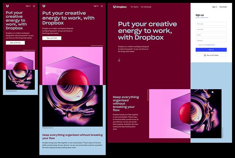
1 – Dropbox
Dropbox web design has leveraged the features of fluid grids and flexible visuals to achieve a stand out user experience. Accounting for each context, Dropbox’s design offers a customized experience across devices and screens. The font color changes to match the background color, and image orientation changes when the user switches from desktop to mobile devices.
There are fine nuances to guide the desktop user such as an arrow to direct him to scroll down for more information. But this arrow is not available on mobile devices as users will automatically scroll down due to its touchscreen capability. Similarly, a sign-up form is visible on desktop devices while it’s hidden on mobile devices behind a call-to-action button due to space constraints.
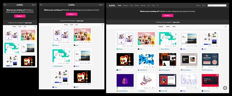
2 – Dribbble
Dribbble website is a benchmark for superior responsive web design. It has a flexible grid and condenses from 5 columns on a desktop and laptop to 2 columns on mobile phones and tablets. Dribbble has removed many unnecessary items to prevent cluttering the user interface. For instance, the images are no longer given attributes like creator, view, comments and likes. They have also hidden the menu bar behind the hamburger icon and got rid of the search bar.
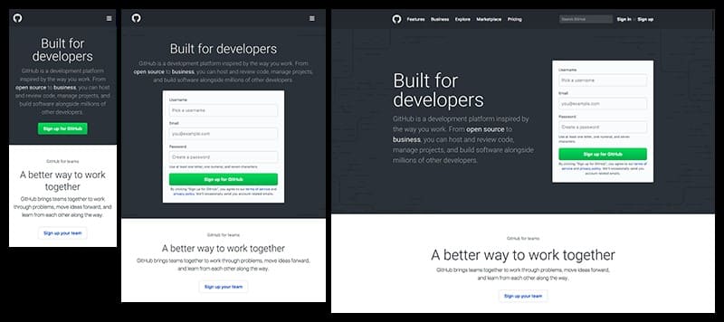
3 – GitHub
Although GitHub’s website offers a consistent user experience across devices, there are some noticeable differences. The area above the fold shifts from a 2-column layout to a 1-column layout. They have made their sign-up form as the central focus on the desktop and tablets while the call-to-action button is the central feature on the mobile device. The user must click the button to invoke the form. GitHub has removed the search bar and hidden the main menu behind a hamburger icon to reduce clutter in the limited space of handheld devices.
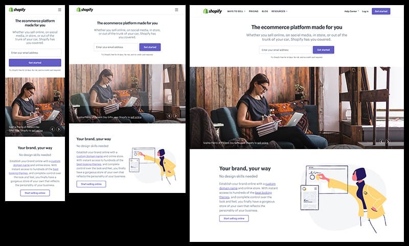
4 – Shopify
Shopify has managed to maintain a consistent user experience across all devices. Only the images and the call-to-action buttons are different between the devices. On PC’s and tablets, the button is to the right of the form fields while it is beneath the form field on mobile devices, the button is on the right of the form field. On mobile devices, it is below the form field. The illustrations are on the content’s right side on PC’s, tablets and below it on mobile devices.
Like most other websites, Shopify’s main menu is replaced with a hamburger icon to save space on mobile devices.
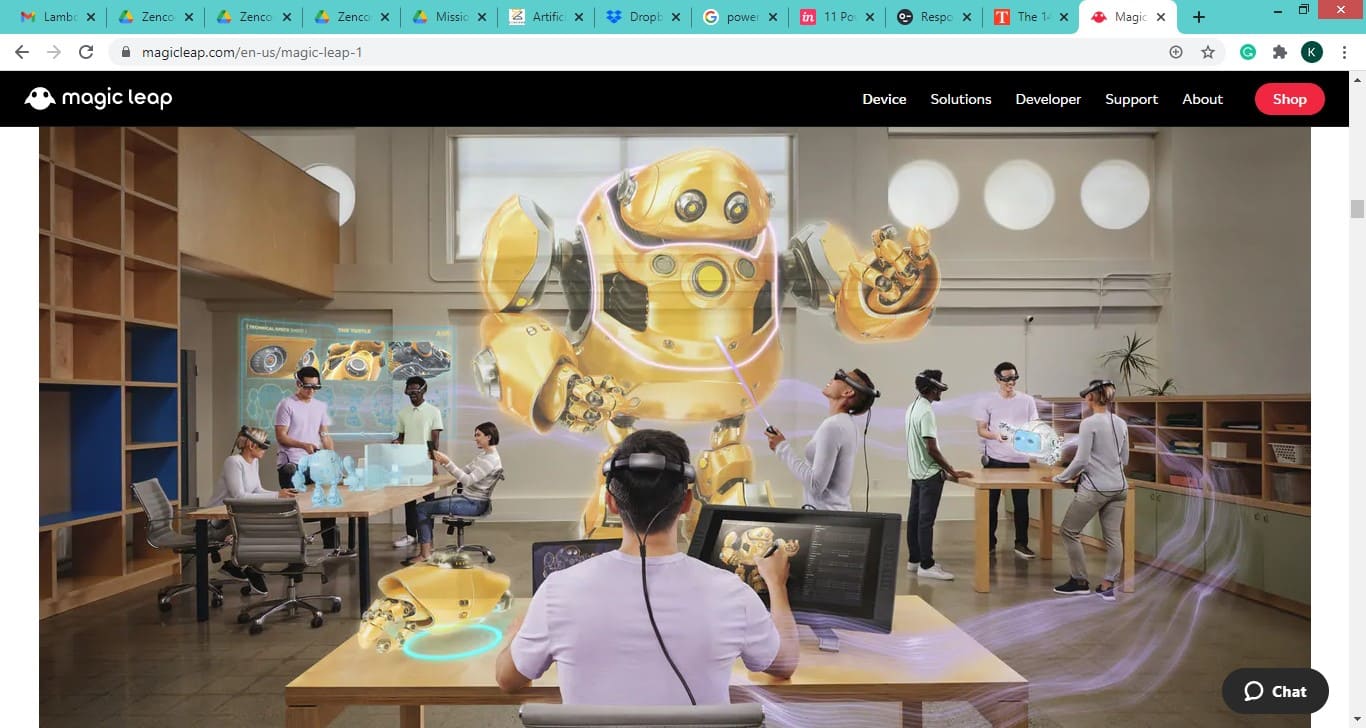
5 – Magic Leap
Magic Leap’s website follows the principle of simple, mobile-first design with parallel scrolling to bring their extraordinary images to life. Magic Leap’s design delivers a uniform and consistent user experience across services and screens with just one exception. The copy that directs the user to scroll is included on desktops and tablets but left out on mobile devices. The assumption for this design is that it is natural for users to scroll on mobile gadgets.
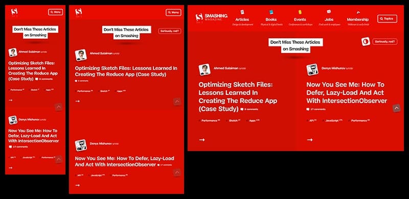
6 – Smashing Magazine
Smashing Magazine web site offers more than just personalized experience to its users. The website includes a two-column layout, complete menu, and a combination letter mark on the desktop that can convert the 2-column to a one-column layout and the full menu to a condensed menu on mobile devices and tablets.
Smashing Magazine’s website is a classic example of inclusive web design. The menu on the desktop machines features both icons and labels. Instead of the standard menu icon, they have opted for a call-to-action button with the word “menu” on it and a search icon. This feature is for the digital novices who might not know that a hamburger icon represents “menu” on mobile devices.
As a result of Smashing Magazines’ exemplary website design, their page loads in less than 2 seconds with a 3G connection which makes up 70% of mobile connections worldwide. Their bounce rate and user frustration levels remain low for their website.
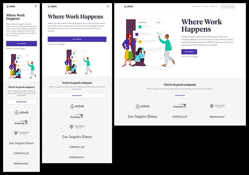
6 – Slack
Slack’s website is famous for being simple and with a human touch. Their flexible grid adapts easily to screens of all shapes and sizes. If a customer logo is presented in a 3-column layout on a laptop and desktop, it will be shown in a single-column layout on mobile gadgets.
Slack’s design is easy to navigate even for novice users. For instance, their call-to-action buttons are placed across the entire column on mobile phones and tablets. This prevents the users from clicking a hyperlink or “Sign up” button.
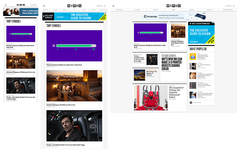
7 – WIRED
WIRED website is known for its dynamic organization of elements. It has several columns and a sidebar for desktop machines that converts to a single column on mobile devices.
While switching from a tablet to a handheld device, the menu shrinks to display only the menu icon, their logo and a link that invites users to subscribe. Adhering to its simplistic design principle, WIRED’s search functionality and ability to filter newsfeed is excluded from the mobile device design.
The USP of WIRED’s website design is the use of flexible images. The shape of the images varies across platforms. On laptops and desktops, the images are cropped into square and rectangle shapes to make them stand out. On all mobile devices, the images are cropped to a 16:9 ratio.
Conclusion
Responsive website design is not only about being mobile and desktop friendly. It also involves aesthetic layout, soothing colors, powerful images, and unique content. The key is to manage the constraints of space and device and create magic with your website design that hooks the viewer right away and holds his attention.
